Fruitbowl* Content Management
A full-scale overhaul of a content and asset management system for a tech giant with internationally localized web pages also customized by business vertical.
Fruitbowl (*Client prefers anonymity) had an existing content management system that had been outgrown and mangled by time. It needed an overhaul badly, so our goal was to improve and update all existing functionality into a new application. I worked with a UX co-worker to redesign everything from the ground up. When I came onto the project, she had defined some basic UI styling, and the high level information architecture.
We used the old tool and input from the product owner to define what were the needed features. The focus was on what needed to be achieved, not on how the old tool handled things. We gathered feedback about what did and didn't work with the old tool, and also implemented some new features the users had wanted for ages.
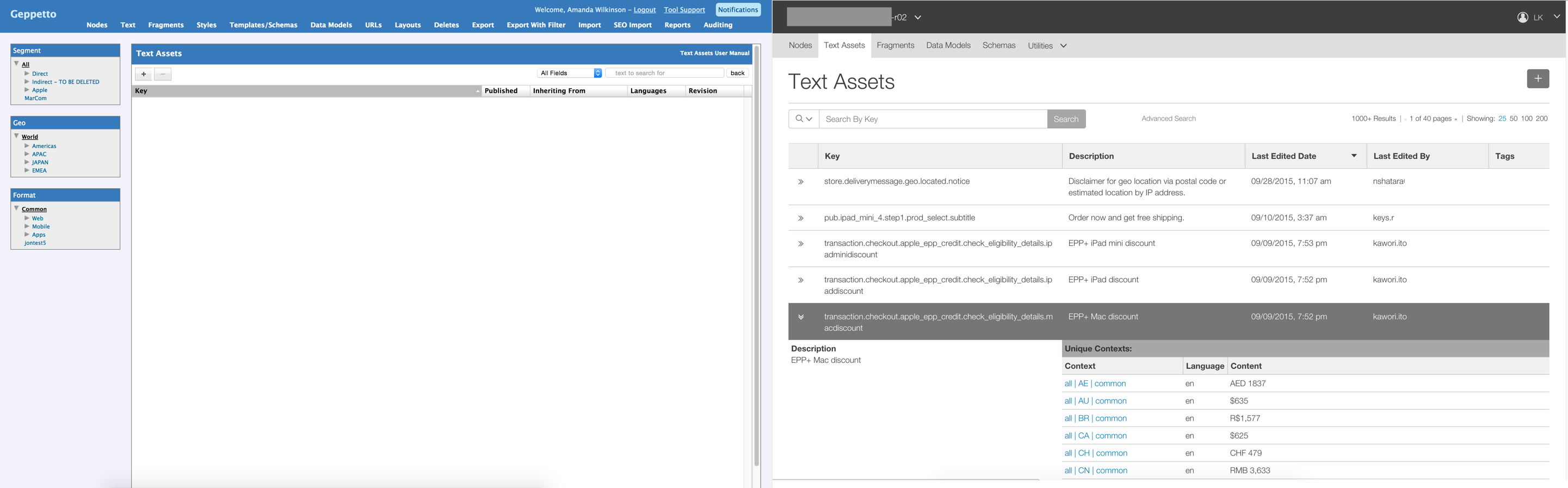
The image above is an example of taking the old tool's view, and improving upon it. Before, a user had to know exactly what the asset they were looking for was called to retrieve it from the system. In the new design, a user could browse through all the assets, or do partial-word searches for what they needed. We also surfaced a lot more contextual information about the assets and where they were used at this high level view.
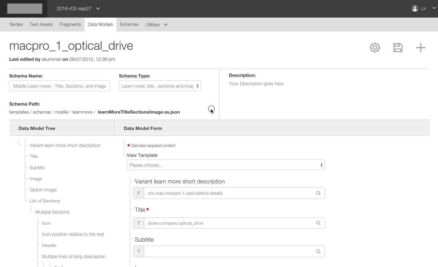
With each section of the system, I created high fidelity prototypes of the interface demonstrating every aspect of functionalty from happy paths, error states, empty/new views, overly crowded option lists, animations, button states cursor changes, etc. I often had to remind stakeholders in design review meetings that my presentation was in fact a prototype and not the finished product.
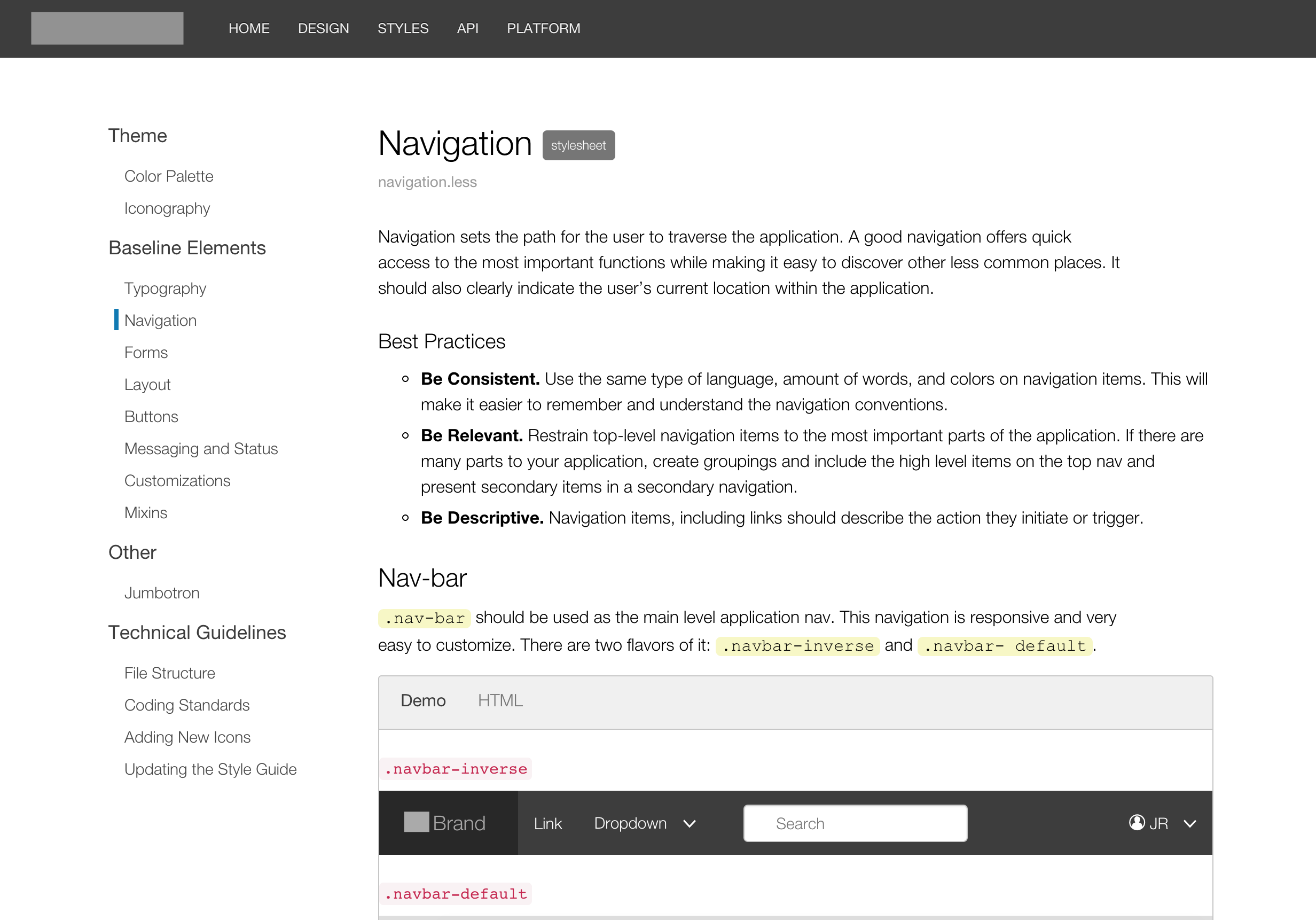
We also created a documentation guide for future design and development. It included not only examples of every design rule, button style, UI component, etc. But also the guiding direction behind how to make choices on brand. For example, the navigation page includes information for best practices to add to the existing navigation:
- Be Consistent. Use the same language type, number of words, and colors. This makes it easier to remember and understand navigation conventions.
- Be Relevant. Restrain top-level navigation items to the most important parts. Create groupings to present secondary items in a secondary navigation.
- Be Descriptive. Navigation items, including links, should describe the action they initiate.
Toward the later stages of design, we were given access to the company's user testing lab. We were able to work with their User Research Specialists to run real-time usability tests for high importance tasks to improve it's clarity and ensure the most important features were able to be understood quickly and easily. It was a blast to see the tests, and to have the wealth of information on where our designs did or did not perform well.
When I left the project, the client downsized my involvement as the tool was very near completion. They were very happy with the work I had done with my co-designer, and as far as I know this tool is still in use today.