SignalFrame
2D & 3D visualizations and analytics for trillions of Global IoT signals and their relationships to each other over space and time.
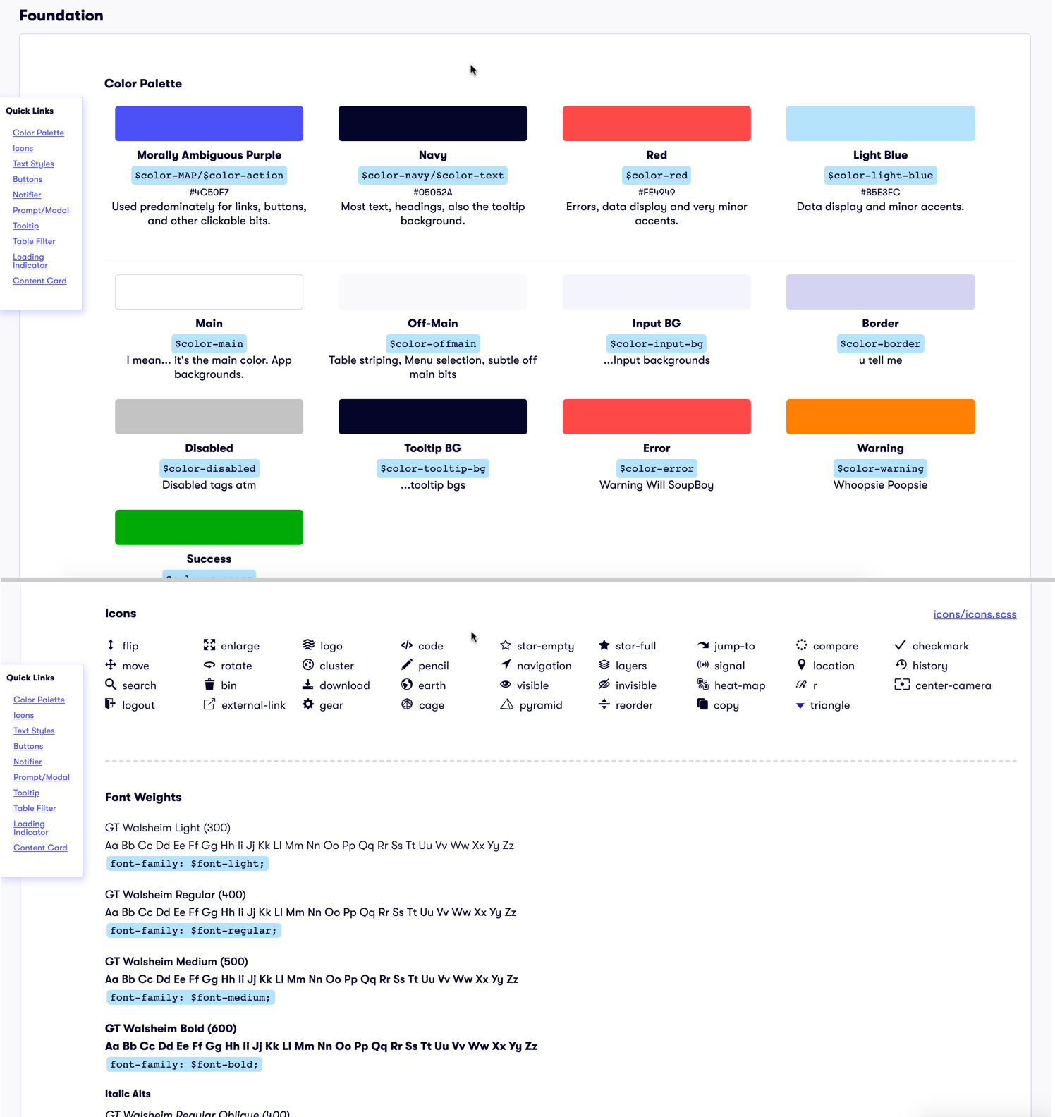
SignalFrame was the freshest start-up I've worked for. I was the first and only designer, joining a front-end team of three. The goal was to make an insanely large, complex, and growing dataset accessible for analysis. But the first thing I did was establish a style guide and clean up/fill-out their component library. This enabled two easy wins. The first win was for quickly picking the low-hanging aesthetic fruit, which aided our business development department who were showing off early versions to potential investors. The second win was for empowering our developers to build interface prototypes that matched our brand, without me having to micro-manage every little pixel. That was the easy part.
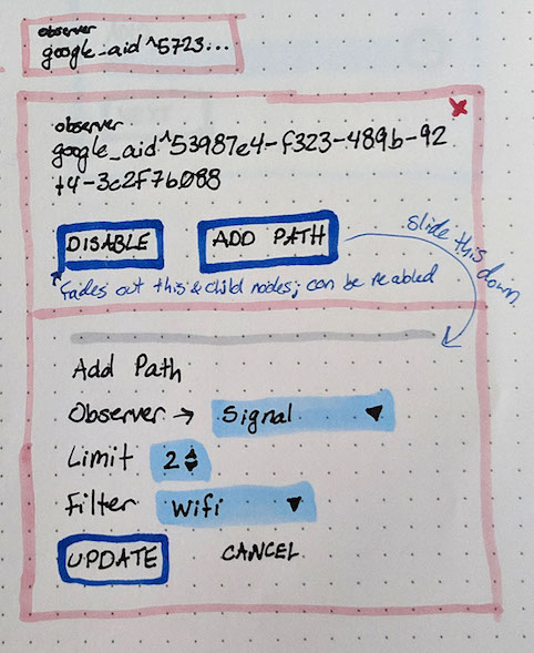
Digging into the real UX problems included exploring 2D and 3D data visualization tools and techniques. I typically like to think and prototype in html/css when possible. But when it's not possible, I sometimes turn to my trusty pen and paper. This let's me see ideas quickly without having to complicate brainstorming with technology. Then I can translate those drawings into digital mocks or code later if I think they are promising.
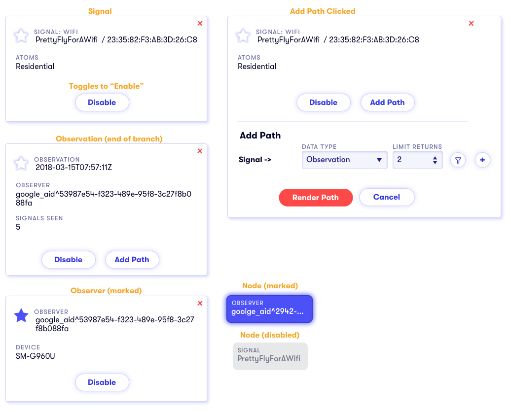
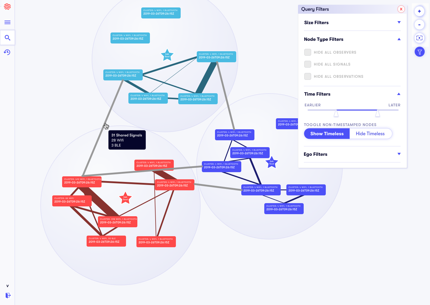
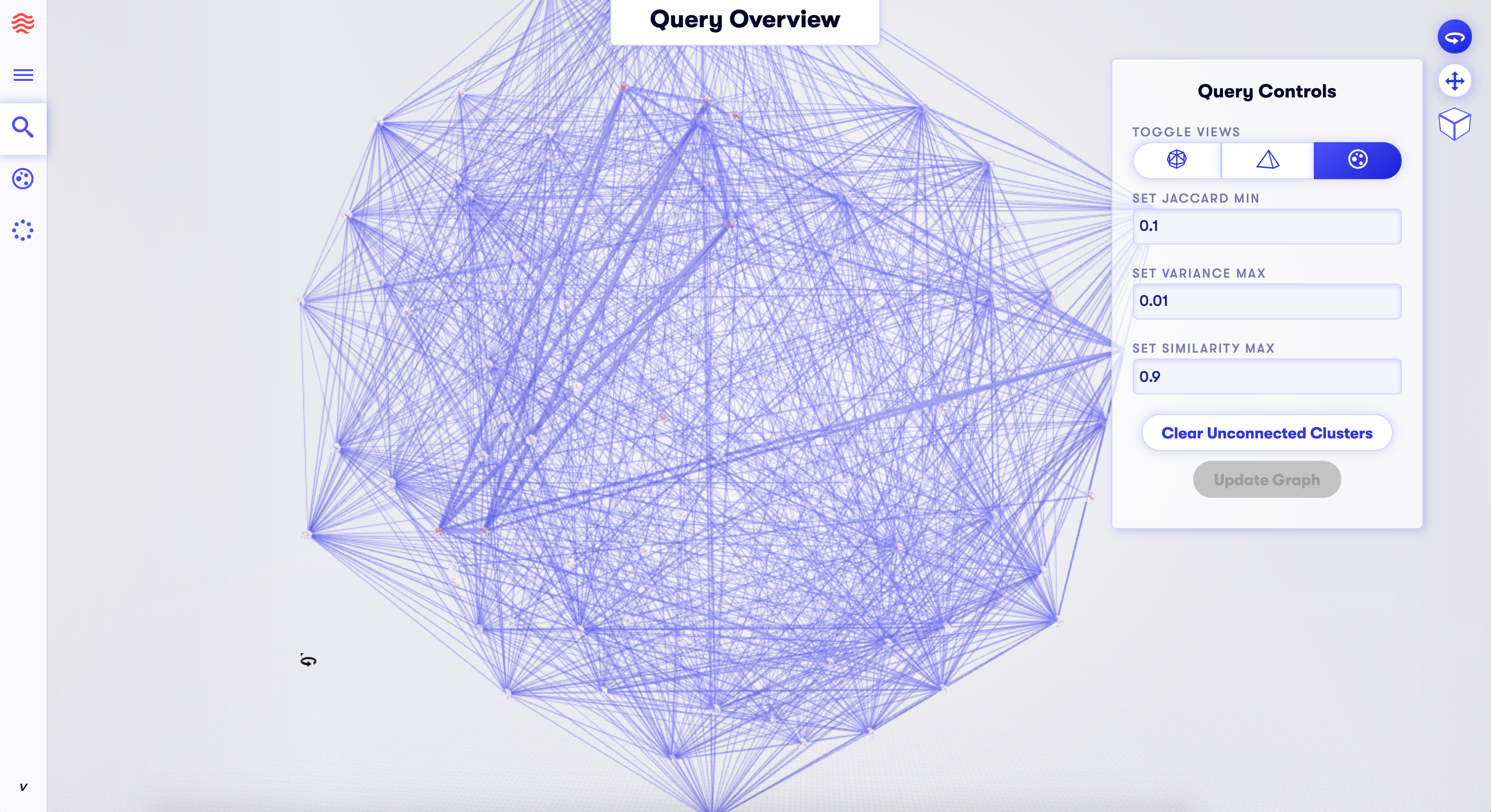
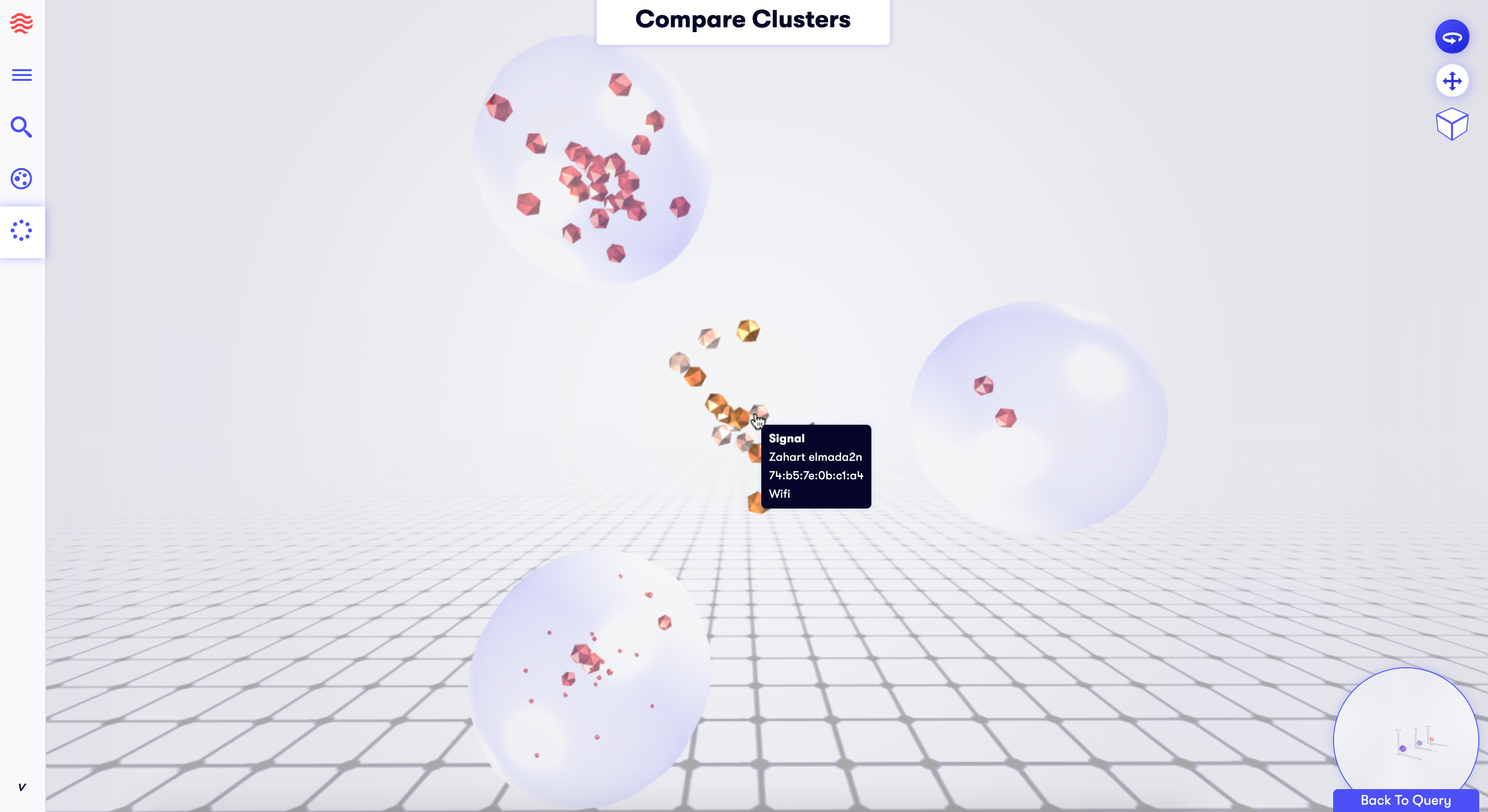
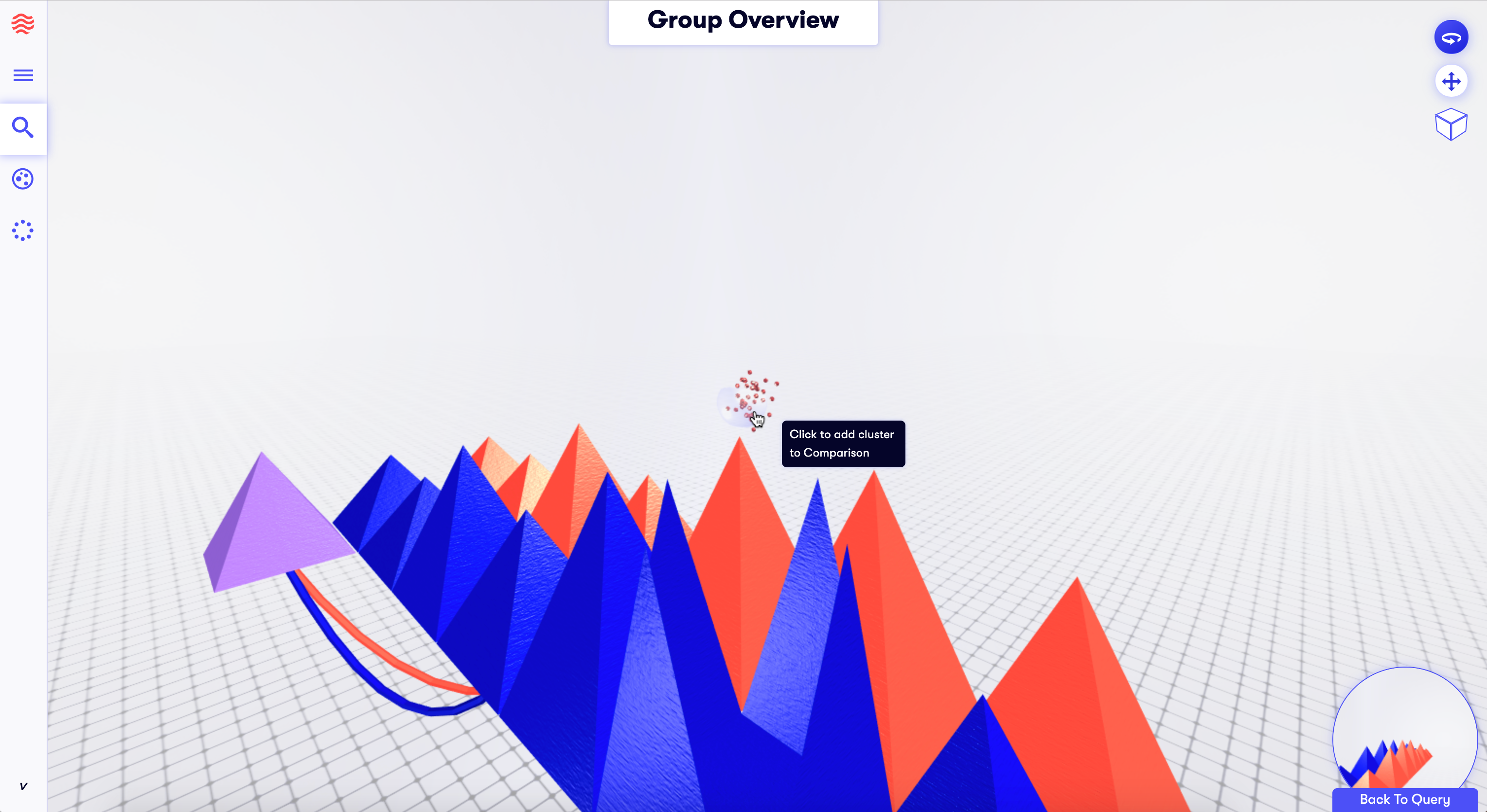
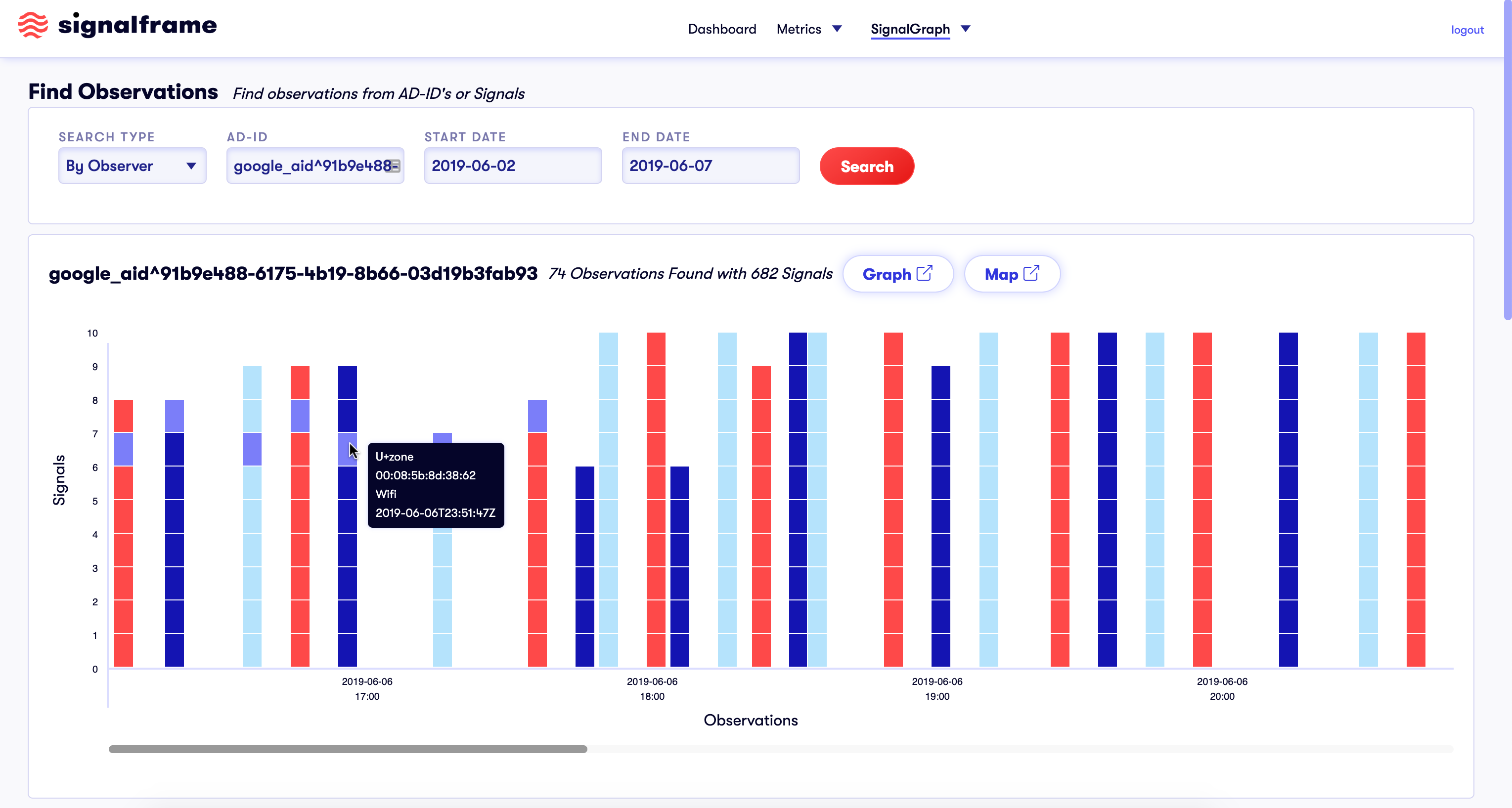
To tackle the more complex data visualization problems, I worked closely with a developer familiar with the graphical JS libraries we were dependent on. We experimented with various styles of nodes, clusters, animations, shapes, sizes, and colors to convey as much information as possible as clearly as possible in 3D space. The dataset was mind-bogglingly huge in breath and depth as we collected an unending stream of signals from all over. The user needed to be able to see the signal information, the information of the observer that collected the signal information, and the individual points of each observation that observer made. Having those three data groups could allow for a rich and in-depth analysis of patterns with devices. So figuring out how to make accessible and navigateable views into subsets of the database was quite an important challenge.
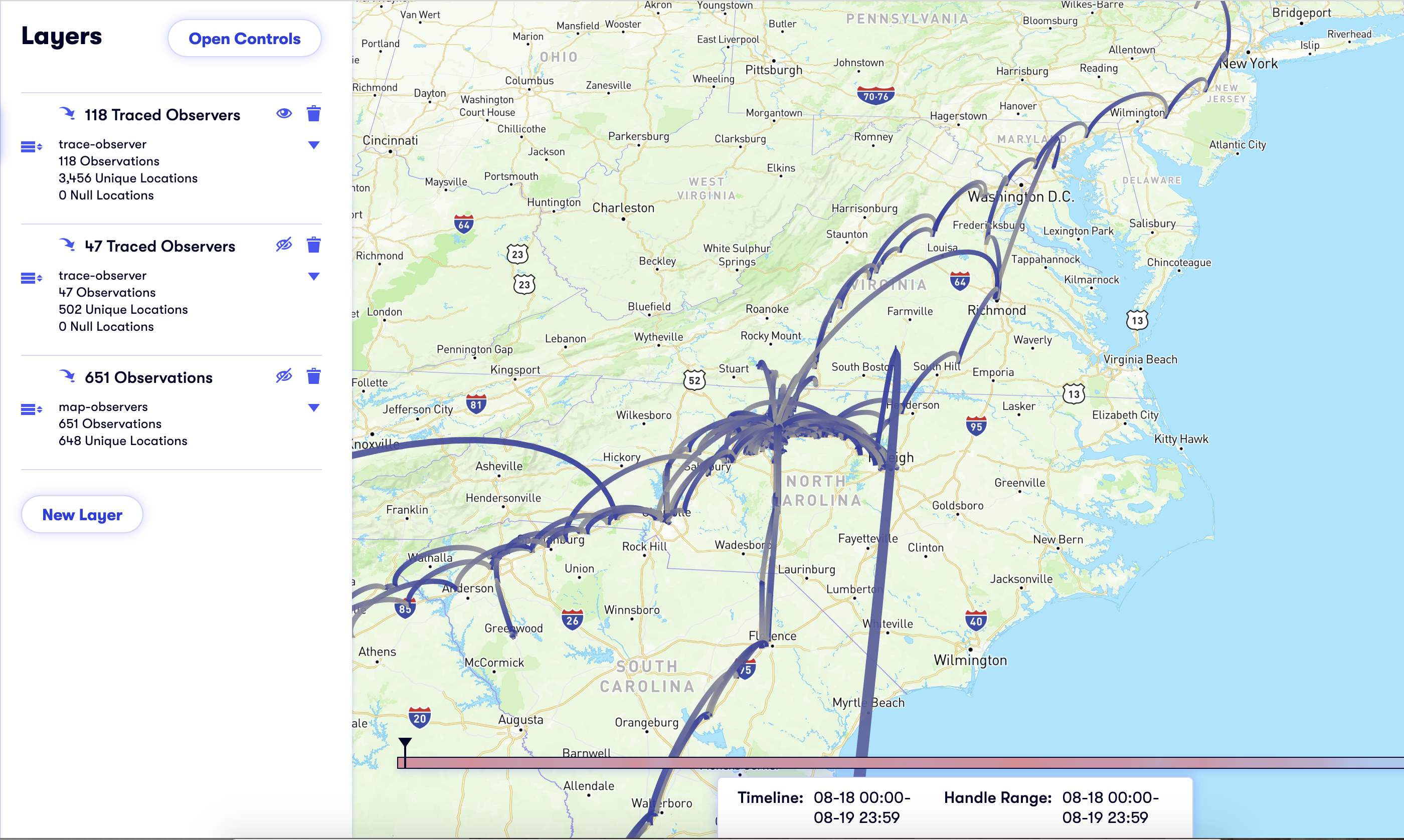
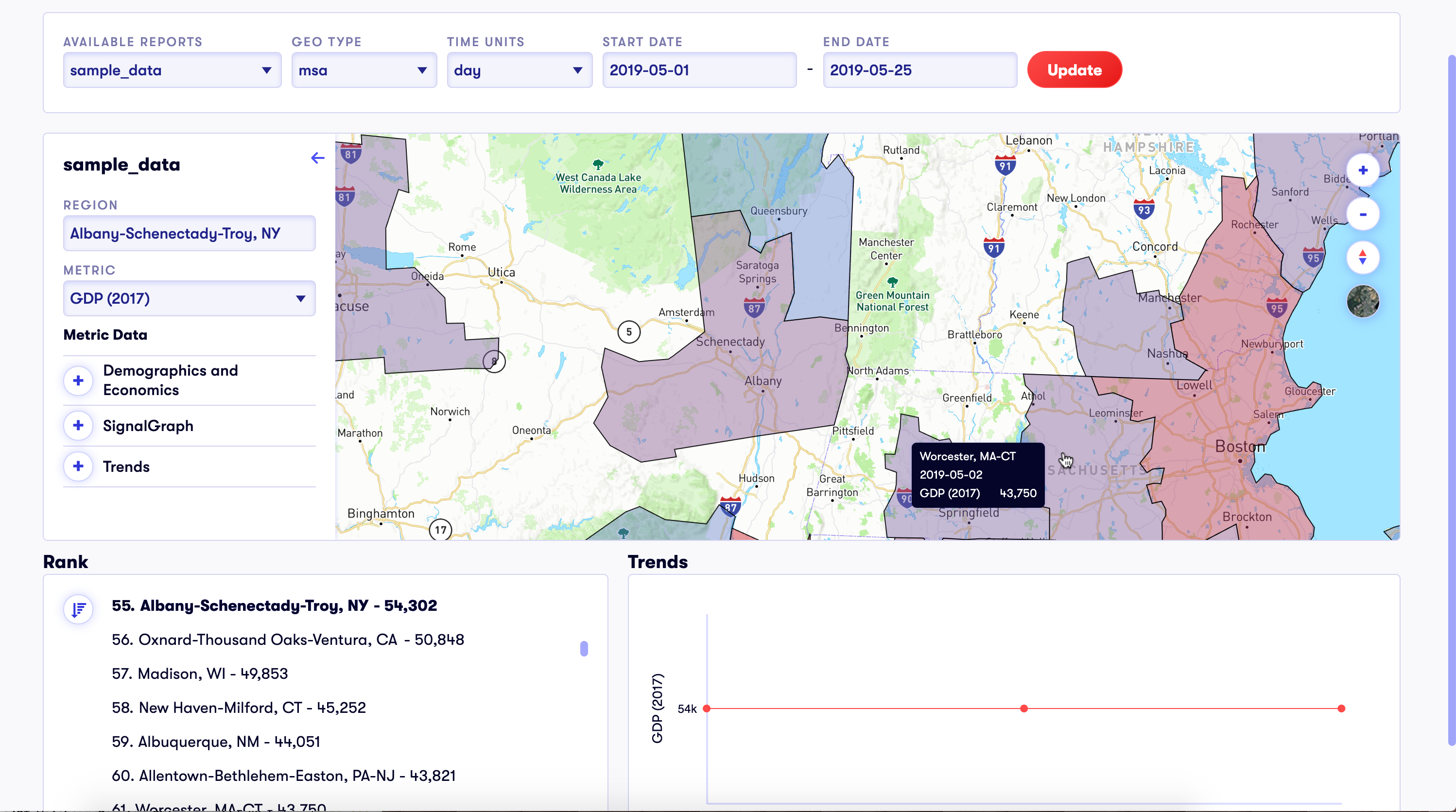
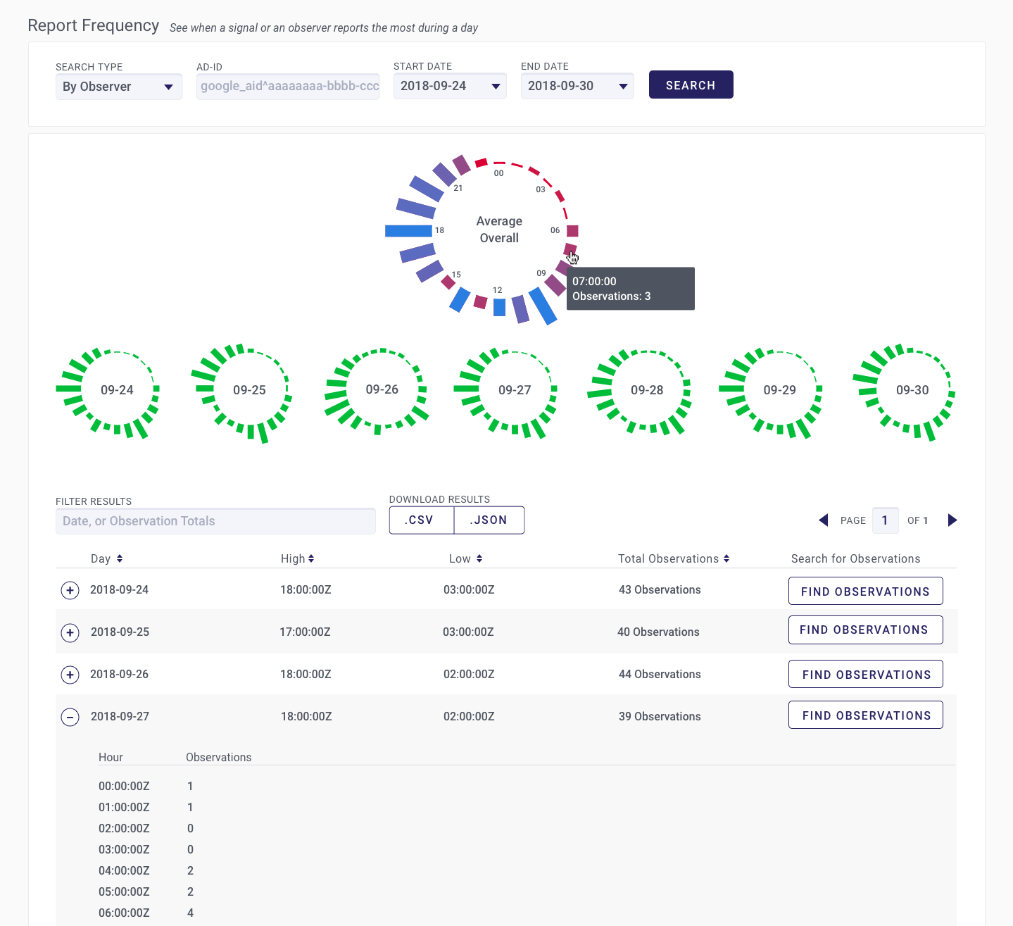
By comparison, the map-based visualizations were much more straightforward. We could map signal points over geography both with specific signals or observers, and in a wider heatmap style. For viewing data over time and space, we overlaid a map with a timeline scrubber to move the dataset forward and backward, which also let us animate the changes between time points. The time scrubber was colored to indicate where the data-rich spots were. In this way we could maximize the amount of information being seen in the interface at any given view.
For the heatmaps we could generalize requested attributes over bigger areas. We explored both tile-based heatmaps, and geopolitical boundaries as heatmap segments. This enabled a broader look at the dataset.
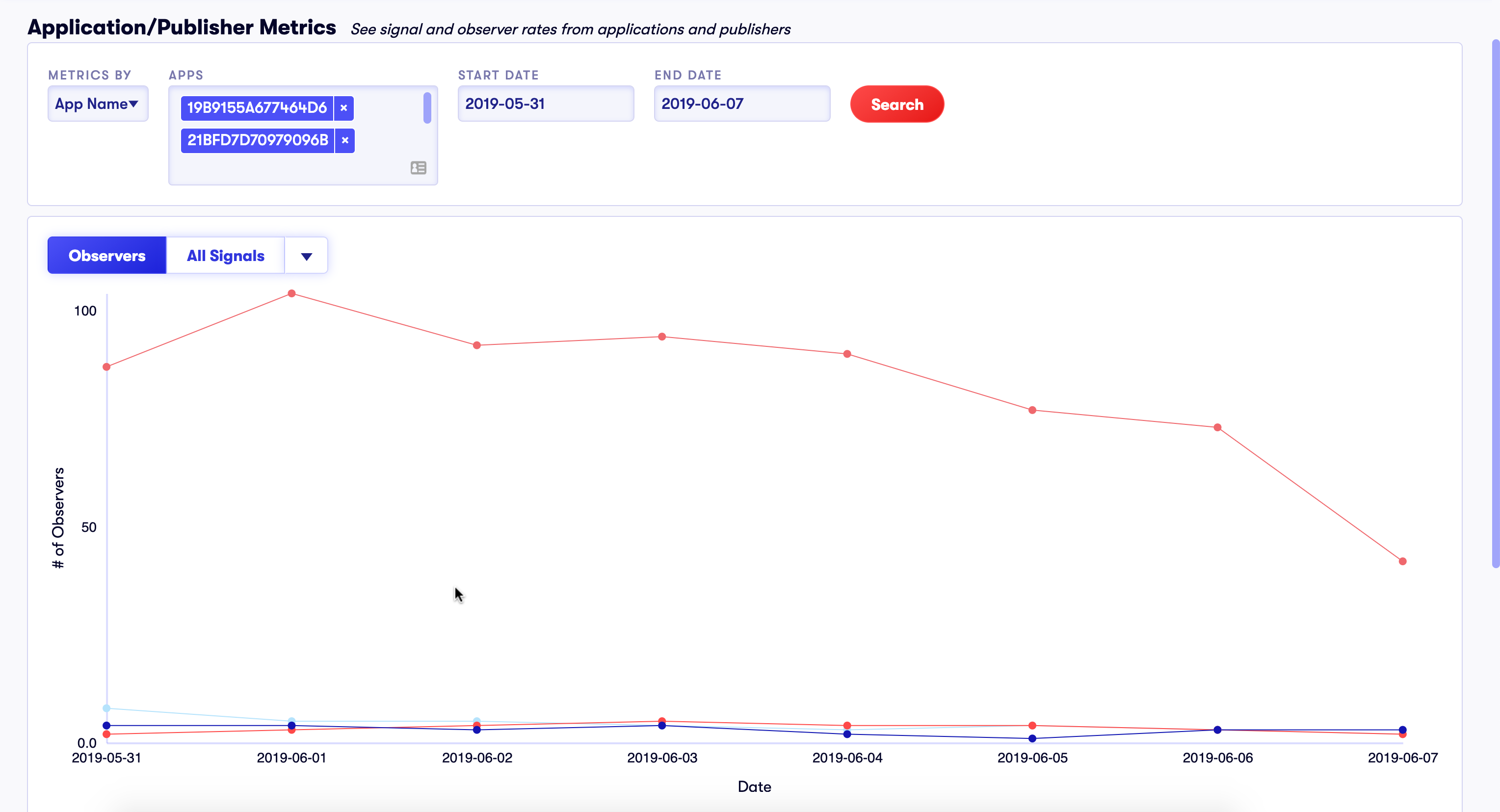
We also created a reporting tool which gave more classic 2D graphs along with tables of the graphed data. We were still creating data-heavy interfaces, but established graph techniques simplified the problem. The goal of each graph was to showcase different approaches to looking at the data. I worked with our business development team to enable their ideas on how to access our data and what kinds of reports were most useful/marketable.
Unfortunately, the company was unable to find enough business to stay viable and lay-offs were heavy. The core concepts were bought out by an investment firm and I honestly have no idea what, if any, of our work still exists or is being used. When I left the company, I did my best to leave all the work tidy and well documented for anyone who may try to pick it back up in the future. The overall concept and scale of this project was both exciting and daunting. I hope one day to work on another project like this.